Customer Segmentation and Clustering
In this article we will explore clustering and customer segmentation using transaction data.
We will mainly focus on k-means clustering and determining the optimal number of groups, but we will also briefly look at the pam algorithm, dendrograms and the gap statistic.
Finally we will examine the created group composition using bar charts and word clouds.
All code and data used is available on github
The data
The data set we will be using is taken from John W Foreman’s book Data Smart, and consists of a file containing descriptions of discounted wine offers, and another with customers discount purchases.
Data Preparation
#Load Libs
require(tibble)
require(tidyr)
require(dplyr)
require(broom)
require(ggplot2)

# read data
offers <- read.csv(file="data\\OfferInformation.csv")
transactions <- read.csv(file="data\\Transactions.csv")

# clean names
colnames(offers) <- c("offer_id", "campaign", "varietal", "min_qty",
                      "discount", "origin", "past_peak")

colnames(transactions) <- c("name", "offer_id")
# get a frequency matrix of whether a customer ordered an offer
tr <- spread(transactions, offer_id, offer_id)
tr[,2:ncol(tr)] <- ifelse(is.na(tr[,2:ncol(tr)]), 0, 1)
# rename columns - to not just be numbers
tr <- tr %>% setNames(sprintf("o%s", names(.)))
names(tr)[1] <- "names"k-means clustering.
k-means is a clustering method which iteratively assigns each data point to a cluster, depending on which cluster centre it is currently closest to. After assigning each point to a cluster a new cluster centre is created based on the mean position of the new members of that cluster. Points are then re-assigned to the nearest new cluster centre. This process is repeated until there are either no more changes, or a set number of iterations is reached.
Distance is important with k-means clustering due to the assignment of cluster membership, so first we will arrange the data to create an n-dimensional space where all offers are of the same magnitude as each other.
This is effectively a frequency table, showing which offers a customer purchased.
How many different clusters?
One of the important factors is how many clusters to create. If we create too few then some groups will be missed or merged, but if there are too many then resources are wasted, groups are split and it becomes more complicated.
Using the broom package we can create multiple models before choosing the number of k-means clusters we’d like to use.# Cluster using k from 1 to 9
set.seed(123456)
kclusts <- data.frame(k=1:9) %>% group_by(k) %>% do(kclust=kmeans(tr[,-1], .$k))
# Store different aspects of each k model
clusters <- kclusts %>% group_by(k) %>% do(tidy(.$kclust[[1]]))
assignments <- kclusts %>% group_by(k) %>% do(augment(.$kclust[[1]], tr[,-1]))
clusterings <- kclusts %>% group_by(k) %>% do(glance(.$kclust[[1]]))
Graphing the clusters
Our data is in multidimensional space so we need to reduce that to 2 dimensional space in order to visually inpect the different groupings.
For this we use Principle Component Analysis (PCA). This transforms the data to create new variables containing the same information but in a transformed space.
These new variables are listed in descending order of the information they contain, we then pick the first 2 variables for our graphs - retaining as much information as possible, whilst working in 2 dimensions.
Here we view the porportion of the variance contained in the first 5 principle components, and it can be seen that the first 2 components, which we will use, contain 25% of the variance between them.# get our pca transformation
pca <- prcomp(tr[,-1])
s.pc <-
summary(pca)$importance[2:3,] %>%
as.data.frame() %>%
rownames_to_column("Description")
s.pc[1,-1] %>%
gather(PC, value) %>%
head(5) %>%
ggplot(aes(x=PC, y=value, fill=PC)) +
geom_bar(stat="identity") +
ylab("Proportion of Variance Explained") +
scale_fill_brewer(palette="Set1")
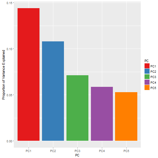
s.pc## Description PC1 PC2 PC3 PC4 PC5
## 1 Proportion of Variance 0.14386 0.10800 0.07104 0.05866 0.05273
## 2 Cumulative Proportion 0.14386 0.25187 0.32291 0.38157 0.43430
Using pca we now transform our data, and then having transformed it we can graph it# transform the data with pca
clusters <- clusters %>% setNames(tolower(gsub("x","o",names(.))))
clusters[,2:33] <- predict(pca, clusters[,2:33])
assignments[,2:33] <- predict(pca, assignments[,2:33])
Visualising K-means groups
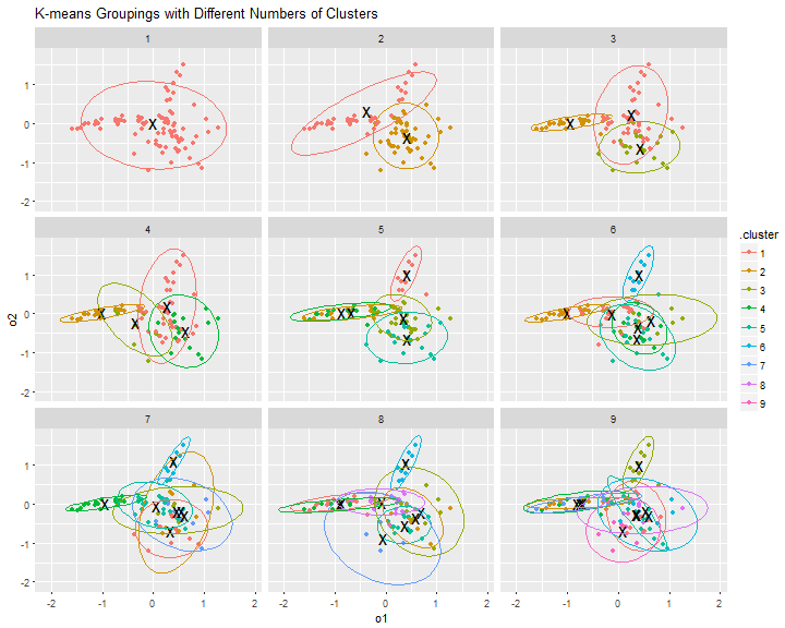
From a visual inspection of the graphs below, the clearest groups would appear to be with k=2, k=3, or k=4.
Although it has to be remembered that we are only looking at 25% of the variance.ggplot(assignments, aes(x=o1, y=o2)) +
geom_point(aes(color=.cluster)) +
facet_wrap(~ k) +
geom_point(data=clusters, size=6, shape="x") +
stat_ellipse(aes(x=o1, y=o2, colour=.cluster), size=0.1) +
ggtitle("K-means Groupings with Different Numbers of Clusters")
Total within-cluster sum of squares
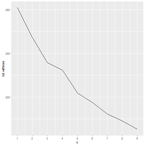
We can also determine the optimal number of groups by looking at the total within-cluster sum of squares, which represents the variance within the clusters.
Looking at the graph below the tot.wininss value decreases as k increases, and at k=3 we can see an ‘elbow’, indicating that whilst clusters beyond this point have decreasing variance, the rate of change of variance has dropped so k=3 might be a good number of clusters.ggplot(clusterings, aes(k, tot.withinss)) +
geom_line() +
scale_x_continuous(breaks=1:9)
Gap Statistic
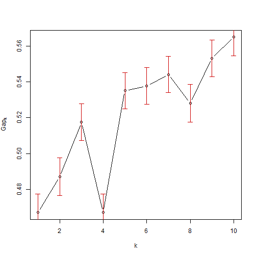
The graph below shows the gap statistic, which is another measure for optimal clustering groups, and we can see that there is a local maxima at k=3 which is one method of ascertaining the optimal cluster numbers.
The Tibs2001SEmax criteria from the cluster package is another method (Tibshirani et al, 2001) and this metric also gives 3 clusters.require(cluster)
set.seed(23456)
gap <- clusGap(tr[-1], FUN=kmeans, K.max=10, B=200, verbose = FALSE)
plot(gap)
maxSE(gap$Tab[,"gap"], gap$Tab[,"SE.sim"], method = "Tibs2001SEmax")## [1] 3
PAM
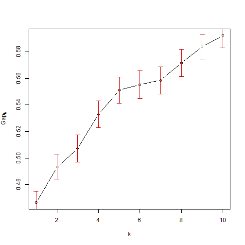
Another method we could use to assign groups is the pam algorithm, which is a clustering method related to kmeans which is said to be more robust to noise and outliers. This method minimizes the sum of pairwise dissimilarities instead of a sum of squared Euclidean distances.
Using the Tibs2001SEmax criteria here suggest the optimal number of clusters is 5.# using pam
set.seed(123456)
pam1 = function(x, k){list(cluster = pam(x,k, cluster.only=TRUE))}
gap <- clusGap(tr[-1], FUN=pam1, K.max=10, B=50, verbose = FALSE)
# plot(pam(tr[-1], 3))
plot(gap)
# Using the criteria recommended by Tibshirani at al.
maxSE(gap$Tab[,"gap"], gap$Tab[,"SE.sim"], method = "Tibs2001SEmax")
## [1] 5
Hierarchical Clustering
Another method of grouping is hierarchical clustering which forms groups from the bottom up. This create a hierarchy based on a measure of dissimilarity (distance) between points.set.seed(12345)
# Compute pairewise distance matrices
dist.res <- dist(tr[-1], method = "euclidean")
# Hierarchical clustering results
hc <- hclust(dist.res, method = "complete")
# Visualization of hclust
plot(hc, labels = FALSE, hang = -1)
# Add rectangle around 3 groups
rect.hclust(hc, k = 3, border = 2:4)
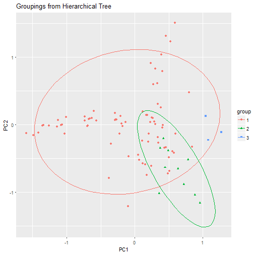
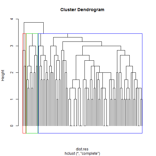 We can see that our dendrogram naturally splits into 3 groups, although 1 of those groups is very small and 1 very large.
# Cut into 3 groups
hc.cut <- cutree(hc, k = 3)

tree.groups <- data.frame(pca$x)
tree.groups$group <- as.factor(hc.cut)

tree.groups %>%
    ggplot(aes(x=PC1, y=PC2)) +
    geom_point(aes(color=group, shape=group)) +
    stat_ellipse(aes(x=PC1, y=PC2, colour=group), size=0.1) +
    ggtitle("Groupings from Hierarchical Tree")
Clustering Summary
This brief overview of a few clustering methods shows that choosing the correct number of clusters isn’t always straightforward.
But for our purposes using k-means with k=3 seems a good choice with clear groupings. This will also help to keep our results simple.
Examining the Groups
Now that we have our groups, we need to understand the differences between them, so that we can then target future offers appropriately.
Each offer is described by different variables e.g. varietal (grape type), country of origin, amount of discount, etc. And any of these, or any combination of these might be a great way of understanding the differences between our groups.
A thorough analysis would look at all of these, but we will just look at varietal.
First we need to join our groupings with our data and tidy it a little.# separate the grouping
my.k <- 3
tr$group <-
assignments %>%
ungroup() %>%
filter(k==my.k) %>%
.$.cluster
# create a new tidy offers data frame
offer.group <-
tr %>%
gather(offer, taken, -names, -group) %>%
filter(taken!=0) %>%
select(-taken) %>%
mutate(offer=as.integer( gsub("o", "", offer) ))
# join the grouping with the offers
offer.group <- left_join(offer.group, offers, by=c("offer" = "offer_id"))
# combine names to help word clouds later
offer.group <-
offer.group %>%
mutate(varietal=gsub(" ", "-", varietal))
And also create some helper functions.# create some word clouds
require(wordcloud)
require(RColorBrewer)
require(knitr)
# f(x) to get an ordered table
getTable <- function(num.group, column.index=5) {
g.w <-
offer.group %>%
filter(group %in% num.group) %>%
select(column.index)
g.w <- data.frame(cbind( Var=names(table(g.w)),
Freq=table(g.w),
proportion=prop.table(table(g.w))),
stringsAsFactors=FALSE ) %>%
arrange(desc(proportion)) %>%
mutate(Var=as.factor(Var),
Freq=as.numeric(Freq),
proportion=as.numeric(proportion))
# add any missing columns
full.list <- data.frame(Var=offer.group[column.index] %>% distinct() %>% .[,1])
g.w <- full_join(g.w, full.list)
g.w[is.na(g.w)] <- 0
g.w
}
Visualising the Groups
# Create a data frame of the tables
freq <- rbind(getTable(1) %>% mutate(group="1"),
              getTable(2) %>% mutate(group="2"),
              getTable(3) %>% mutate(group="3"),
              getTable(1:3) %>% mutate(group="All")) %>%
    mutate(group=as.factor(group)) %>%
    rename(Offer=Var)

# View proportions
freq %>%
    filter(group!="All") %>%
    ggplot(aes(x=group, y=Freq, fill=group)) +
    geom_bar(position = "dodge", stat="identity") +
    facet_wrap(~Offer,nrow = 3) +
    scale_fill_brewer(palette="Set1") +
    ggtitle("By Varietal") +
    theme(plot.title = element_text(hjust = 0.5))
# View proportions
freq %>%
    filter(group!="All") %>%
    ggplot(aes(x=Offer, y=Freq, fill=Offer)) +
    geom_bar(position = "dodge", stat="identity") +
    facet_wrap(~group, nrow = 3) +
    scale_fill_brewer(palette="Set1") +
    ggtitle("By Group") +
    theme(axis.text.x=element_blank(),
          plot.title = element_text(hjust = 0.5))
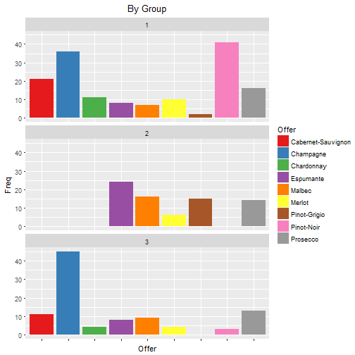
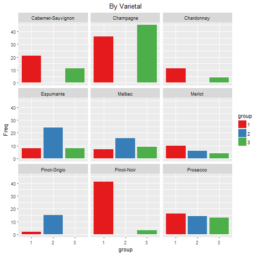
From these graphs it can be seen that the groups have the following preferences:
- Group 1
- Pinot Noir, Champagne and Cabernet Sauvignon
- Group 2
- Espumante, Malbec, Pinot Grigion, Prosecco
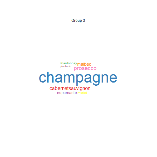
- Group 3
- Mainly Champagne
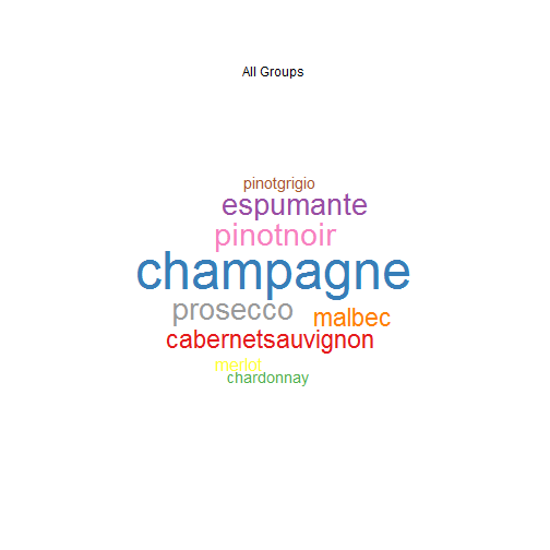
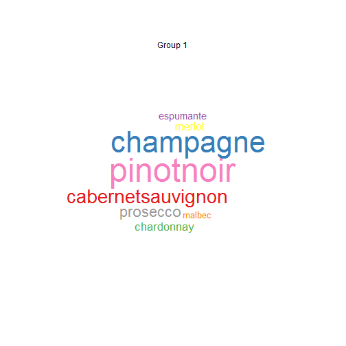
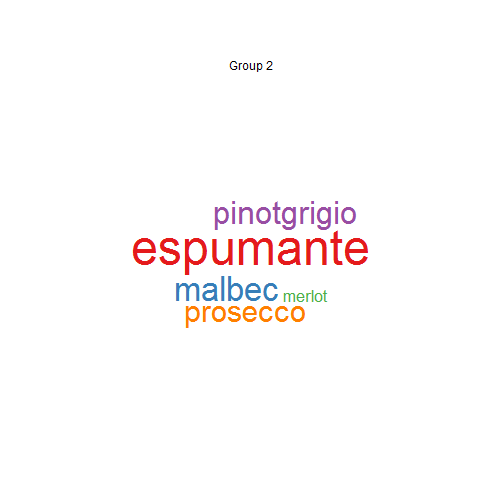
Using Word Clouds
Using word clouds shows the same groupings.getWordCloud <- function(num.group, column.index=5) {
offer.group %>%
filter(group %in% num.group) %>%
.$varietal %>%
wordcloud(
random.order=FALSE,
colors=brewer.pal(length(unique(.)),"Set1"),
ordered.colors=TRUE,
scale=c(2.5,0.1),
rot.per=0
)
if (length(num.group)==1)
text(x=0.5, y=0.9, sprintf("Group %d", num.group))
else
text(x=0.5, y=0.9, "All Groups")
}
par(mfrow = c(2, 2))
# All Data
getWordCloud(1:3)
# Group 1
getWordCloud(1)
# Group 2
getWordCloud(2)
# Group 3
getWordCloud(3)
 |  |
 |  |
Summary
We have looked at 3 different clustering methods, k-means, pam and hierarchical, and also at determining the optimal number of clusters. Before choosing k-means with k=3.
We then visualised the results showing some clear differences between groups. These differences were emphasised using word clouds.
The next step would be to target these groups with offers which are tailor made for their preferences, and then analyse the difference in sales.
Feel free to comment below with any thoughts, corrections etc.