Chick Weight
This is meant to be viewed as a slideshow which can be viewed here
This is a practise presentation using shiny, ggplot and ggvis to explore the ChickWeight dataset.
Unfortunately the interactive shiny/ggvis parts don’t work on github, so this version will just show static images.
The ChickWeight dataset has 578 rows and 4 columns from an experiment on the effect of diet on early growth of chicks.
First we will explore the dataset and then we will compare the effect of diet on chick weight.
Variables
- Weight
- A numeric vector giving the body weight of the chick (gm).
- Time
- A numeric vector giving the number of days since birth when the measurement was made.
- Chick
- An ordered factor with levels 18 < … < 48 giving a unique identifier for the chick.
- Diet
- A factor with levels 1-4 indicating which experimental diet the chick received.
Summary of the Data
summary(cw)## weight Time Chick Diet
## Min. : 35.0 Min. : 0.00 13 : 12 1:220
## 1st Qu.: 63.0 1st Qu.: 4.00 9 : 12 2:120
## Median :103.0 Median :10.00 20 : 12 3:120
## Mean :121.8 Mean :10.72 10 : 12 4:118
## 3rd Qu.:163.8 3rd Qu.:16.00 17 : 12
## Max. :373.0 Max. :21.00 19 : 12
## (Other):506Weight over Time (Hoverable)
## Warning: Can't output dynamic/interactive ggvis plots in a knitr document.
## Generating a static (non-dynamic, non-interactive) version of the plot.Weight Density Plot
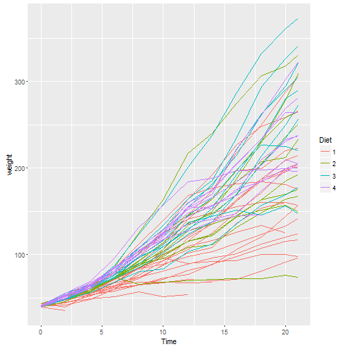
Growth Plot for Individual Chicks
Summary
From our quick data exploration we can see that there are:
- 50 chicks
- On 4 Diets
Over 21 days
- Weight
- Range 0 < w < 400
- Mean of 121
- Median of 103
- Standard deviation of 71
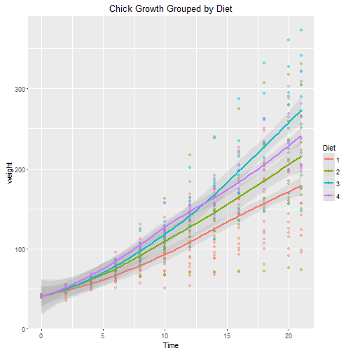
Scatter Plot of Growth Data
## Warning: Can't output dynamic/interactive ggvis plots in a knitr document.
## Generating a static (non-dynamic, non-interactive) version of the plot.Scatter Plot of Data Grouped by Diet
BoxPlot of Weight Data Grouped by diet (Hoverable)
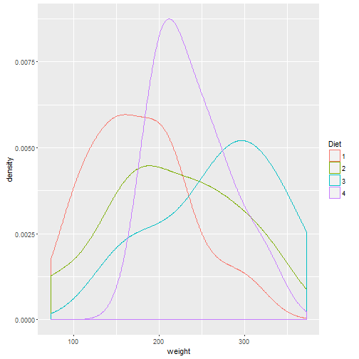
Final Weight Density Grouped by Diet
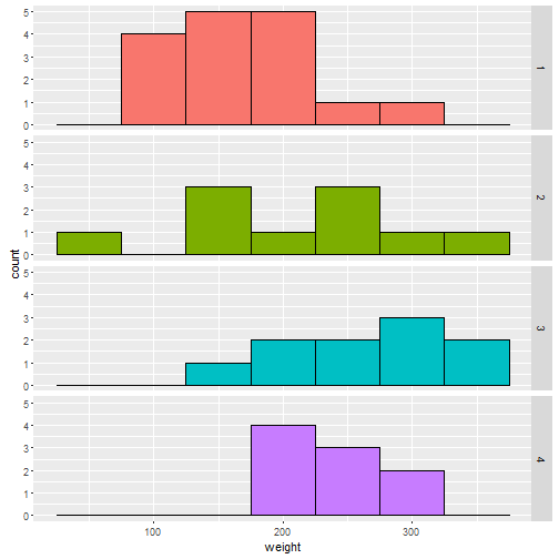
Final Weight Histogram Grouped by Diet
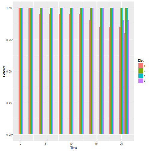
Survival Rate Grouped by Diet
Summary of Final Weights
Grouped by Diet
##   Diet Num min max     mean median       sd
## 1    1  16  96 305 177.7500  166.0 58.70207
## 2    2  10  74 331 214.7000  212.5 78.13813
## 3    3  10 147 373 270.3000  281.0 71.62254
## 4    4   9 196 322 238.5556  237.0 43.34775
Conclusions
- Diet #3 gives the highest mean and median weight
- Diet #4 is the most consistent with the lowest standard deviation
- Diet #1 has the highest mortality rate
- Diet #4 has the biggest mean weight until day 12 - After which Diet #3 took over
In conclusion, for a fixed Diet, then #3 would be the best choice if selecting for mass, but if uniformity was the desired outcome, then Diet #4 would be the best choice.
It would be worth investigating whether a diet consisting of Diet #4 for the first 10-12 days followed by Diet #3 leads to an increased yield.
The github repository for this project can be viewed here.